overview
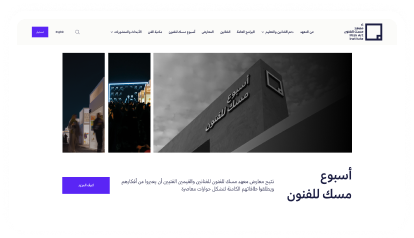
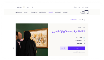
Misk Art Institute is a cultural organization in Saudi Arabia that supports emerging artists and promotes access to the arts. They partnered with us to redesign their digital platform, making it easier for artists to join courses, apply for residencies, upload work, and engage with exhibitions like Misk Art Week.

UX solution
We began with a comprehensive UX audit and heuristic evaluation to uncover pain points across the platform. This helped us identify usability issues, broken flows, and missing elements, especially in key journeys.
We analyzed regional and global platforms in the art and culture space to benchmark best practices. This gave us valuable insights on content organization, engagement strategies, and user flows that resonate with creative communities.
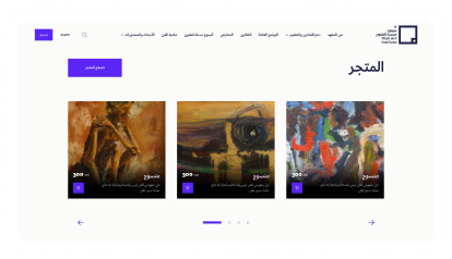
We restructured the site’s architecture by grouping related features, removing redundancies, and creating clear content hierarchies. This made it easier for users to navigate between modules like exhibitions, courses, residencies, and events.
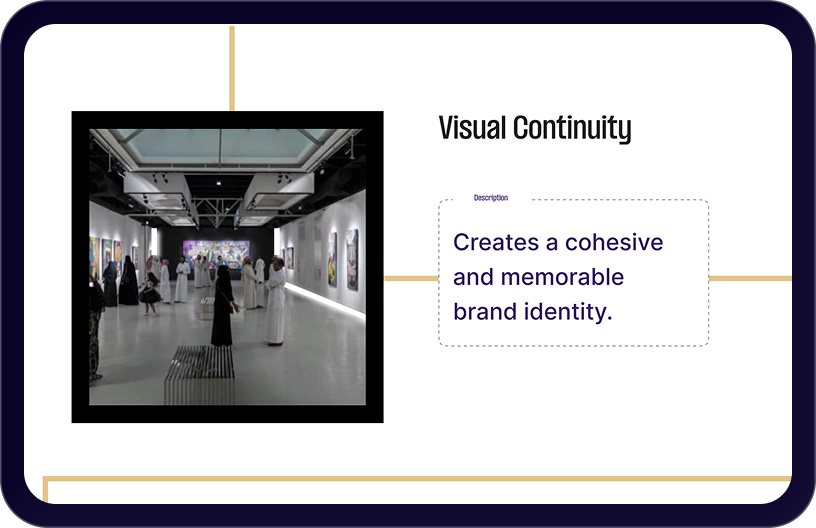
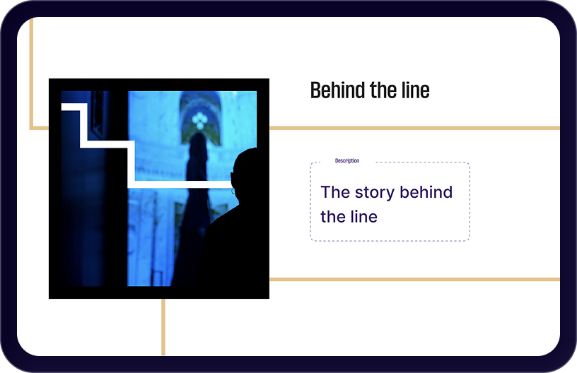
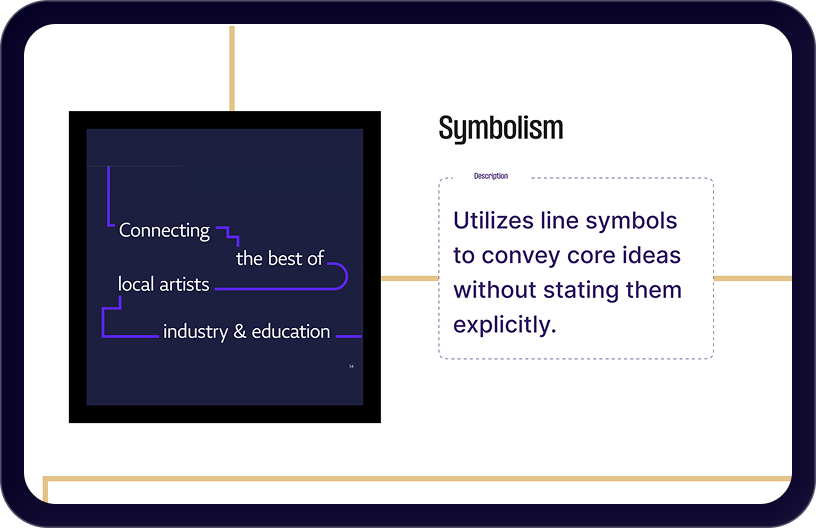
We created early sketches and mood boards to explore layout ideas, colors, and visual tone. This helped align the design with Misk’s artistic identity and set a clear direction before moving into final UI design.
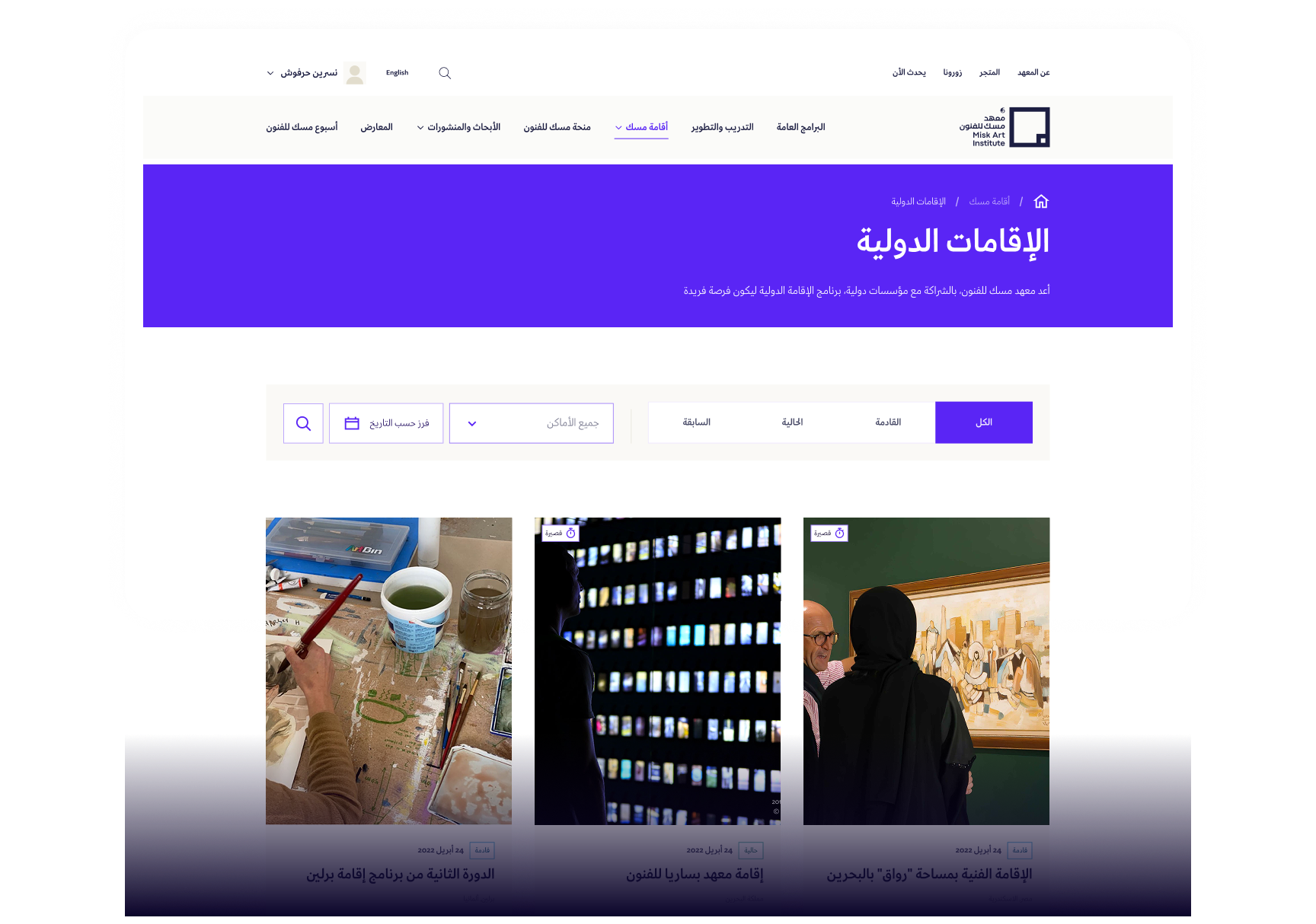
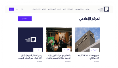
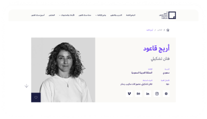
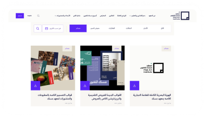
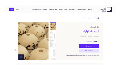
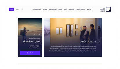
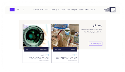
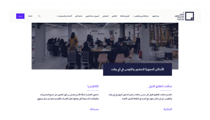
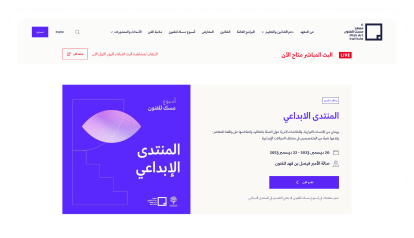
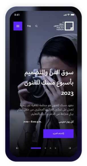
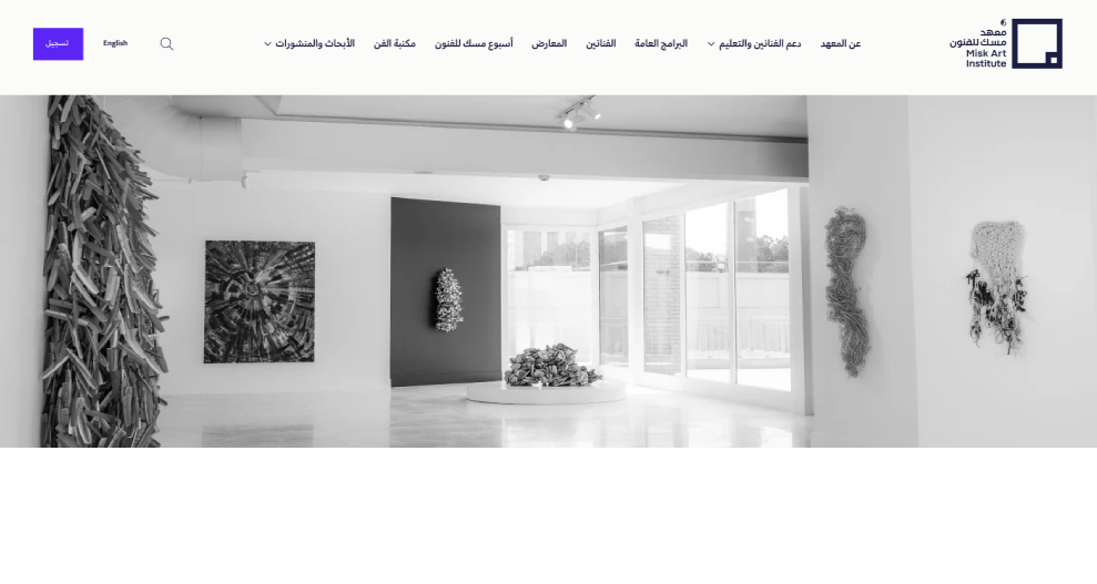
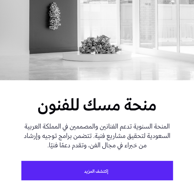
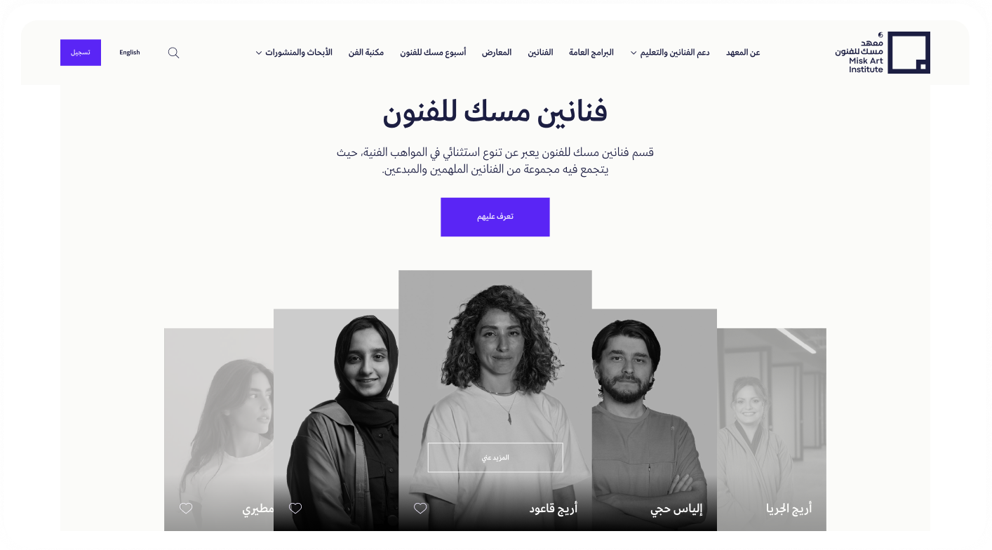
Using our findings, we explored early concepts through sketches and mood boards to align on tone and layout direction. We then designed clean, mobile-friendly interfaces that reflect Misk’s identity, introducing consistent layouts, clear CTAs, and a structured design system. This included typography, color, and reusable components to ensure an intuitive, inclusive, and scalable user experience.
We began with a comprehensive UX audit and heuristic evaluation to uncover pain points across the platform. This helped us identify usability issues, broken flows, and missing elements, especially in key journeys.
We analyzed regional and global platforms in the art and culture space to benchmark best practices. This gave us valuable insights on content organization, engagement strategies, and user flows that resonate with creative communities.
We restructured the site’s architecture by grouping related features, removing redundancies, and creating clear content hierarchies. This made it easier for users to navigate between modules like exhibitions, courses, residencies, and events.
We created early sketches and mood boards to explore layout ideas, colors, and visual tone. This helped align the design with Misk’s artistic identity and set a clear direction before moving into final UI design.
Using our findings, we explored early concepts through sketches and mood boards to align on tone and layout direction. We then designed clean, mobile-friendly interfaces that reflect Misk’s identity, introducing consistent layouts, clear CTAs, and a structured design system. This included typography, color, and reusable components to ensure an intuitive, inclusive, and scalable user experience.